Design Analysis
Now that this little project is done, I want to talk a bit about the process and design ideas. If you haven't played this demo yet and still want to experience it before reading this devlog, go ahead! This will contain spoilers for all areas.
Initially, I wanted to have three main areas with different atmospheres and themes: a regular factory building, a deep underground area, and the center of the factory. However, I had to give up on the third area as I didn't allocate enough time for unexpected problems and necessary iterations. So, let's start with the first area.
This area had two purposes. The first was to introduce the player to the main mechanics and present an easy puzzle. The second was to set the tone for the story and introduce the player to the general setting. Here's the design sketch I made before starting to create the level:
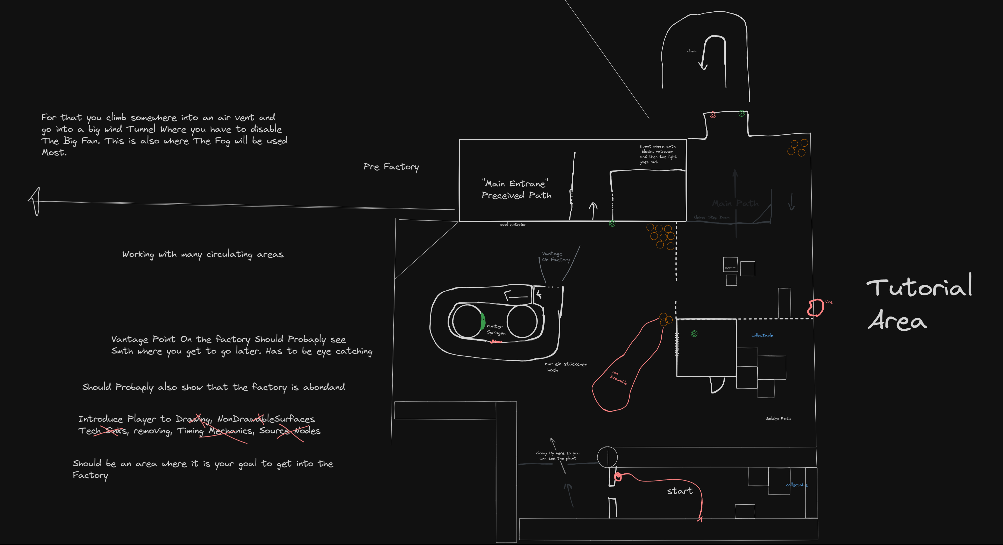
This wasn’t the first iteration, but it didn’t change much, as I didn’t document most of the changes in this file.
So, let’s start at ... well, the beginning. The purpose of the starting area was to trap the player in a space where they had to learn the basic drawing mechanic to progress.
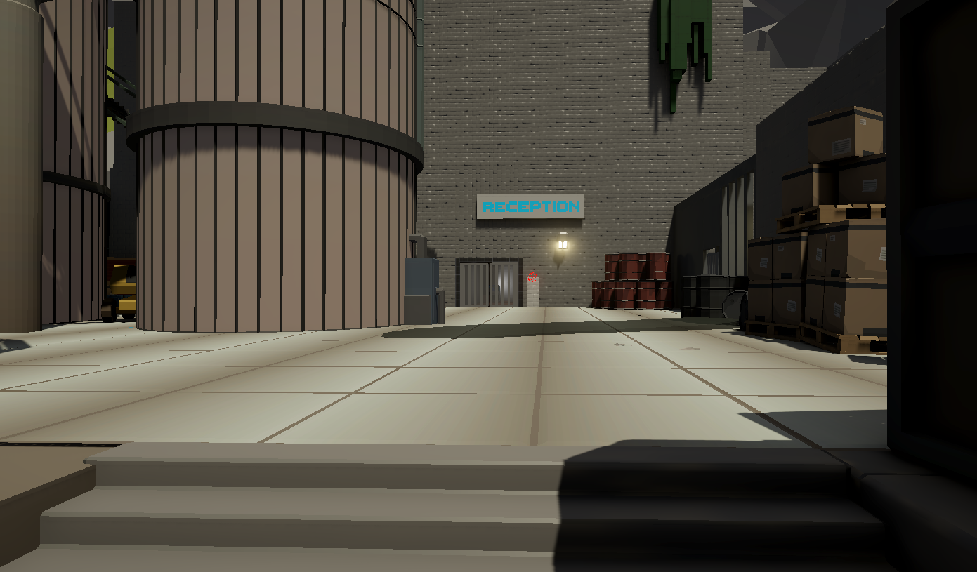
Then, when you exit this area, you get an initial view of the entrance to the Factory Reception.
This is where I wanted the player to go first, as they had to find the little room afterward where they could open the door to the closed-off area. This turned out to not work well because most of the players would explore first and find the little room before. Then, they always wanted to activate the room first before actually going to the reception entrance. So my solution was to lock this room until they activated the door to the reception. I didn't like this solution as it was kinda forced, but the alternative would've been to redesign most of the layout and rebuild it. Also, the force version worked quite well as the players understood that they couldn't continue in the reception and found the Main Path fast enough.
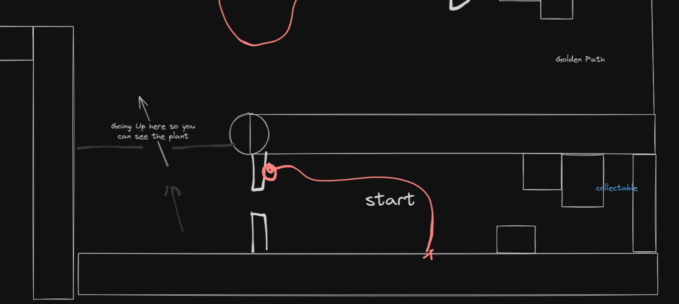
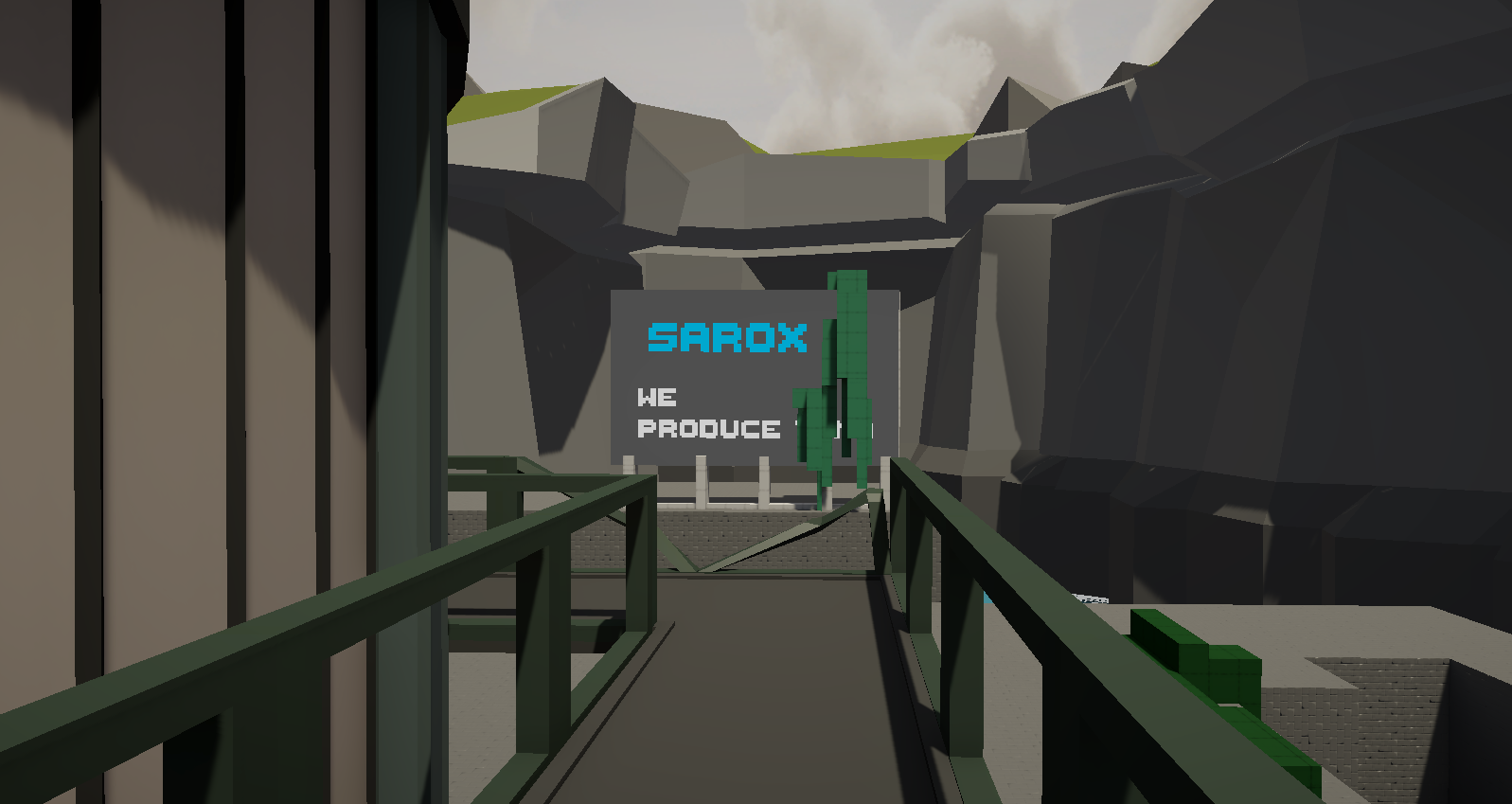
Now, the first puzzle in itself isn't complex, but that wasn't the purpose. To solve this problem, you need to bring a plant down from the two big refinery towers. On the way there, there will be a broken railing, which enables the player to see a big billboard that tells you a bit about the factory.
Also, you were supposed to see Area 3 from up here, but that didn't finish.
Another reason why I made the player go up here is because I wanted to work quite a lot with verticality in the level. This lets the player feel a sense of freedom, which will be later taken away by going underground. Also, this encouraged different types of players to play according to their preferences. The typical player would go up here and solve the puzzle, and maybe also see some collectibles I hid there on the way down.
A player who wants to explore a lot or who wants to break the game really badly will try to jump off the tower in some directions to skip some other areas. I could have removed these jumps, but they enjoyed cheesing the game during playtesting, and it was a bit harder than the normal way, so I left it in.
When you take the normal path, you would go into the reception, where you are greeted with a more soothing atmosphere. Everything is well-lit, nothing is broken(except the light baking), and there is nothing asked of the player.
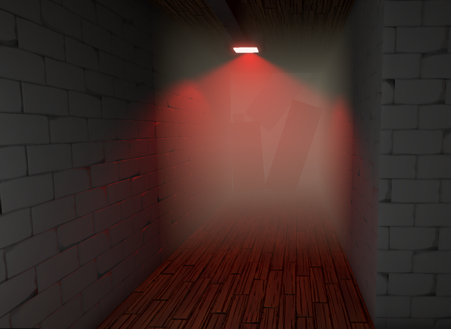
When they try to continue, they will be hit with a kind of jumpscare, which quickly changes the mood in the room. Well, the building collapses in front of them, which acts as a way of saying," You can't go on here; find another path."
Then, the player has to solve the harder second puzzle in order to get underground. What is worth mentioning here is that I worked a lot with circulating player paths. Almost every obstacle is placed so that you can loop around it. This really adds to the player's walkthrough.
When talking about the puzzle leading you to the second area, there are a few things to address here. Let's get through the little ones first.
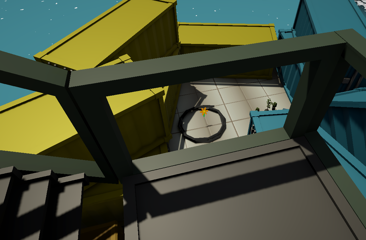
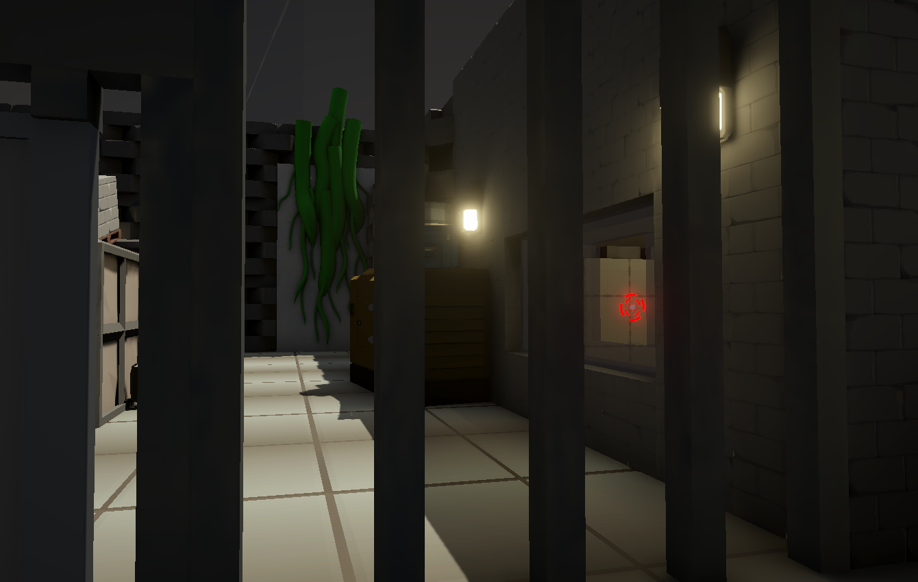
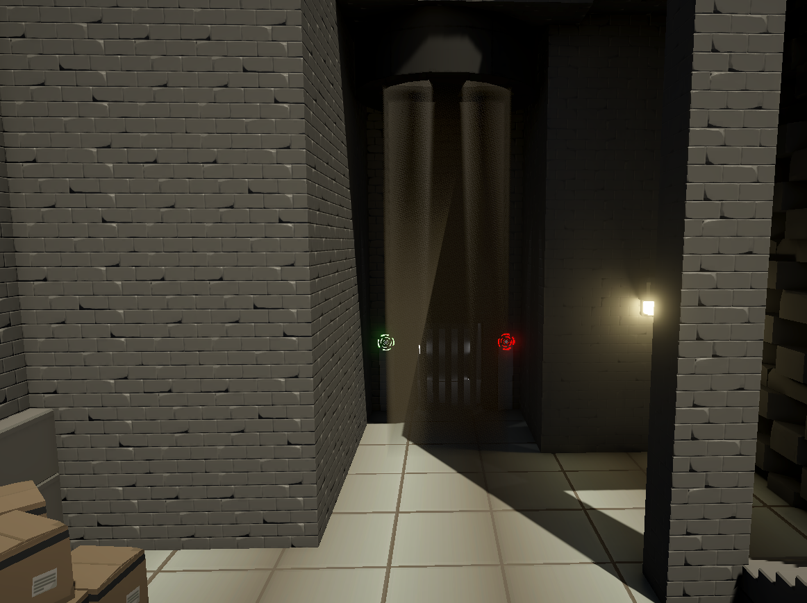
Before you get to enter the puzzle, you'll be able to see two things. The first one is a new color of vines you can draw with. This acts as a foreshadowing. The other thing is the way to get to this puzzle. You can see the trigger to unlock the door to the area through a glass pane where I left a piece out to give an even better sightline.
I tried foreshadowing the next area a bit by adding a ventilation exit, which spews out pollution. This also shows the player what his goal in this puzzle is, as the ventilation exit is moving the pollution to attract attention.
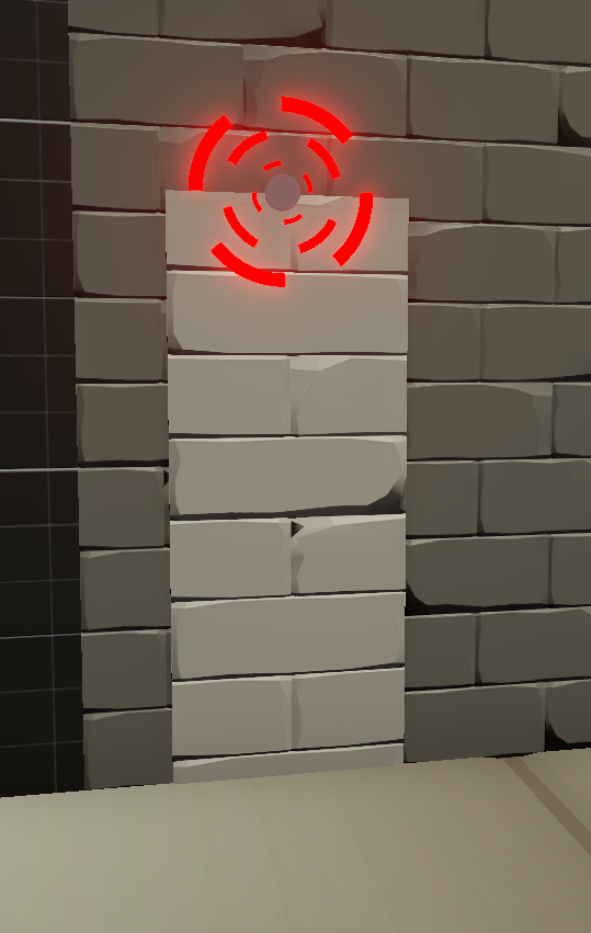
Now, let's move on to the big problem, which really showed here for the first time. Our main mechanic was to draw on stuff, and I used this to restrict the player in my level to prevent multiple cheeses and to create puzzles. It wasn't entirely clear how we wanted the player to know if he could draw on a surface. My solution for this level became that paintable surfaces are generally white.
The other way of showing this was that the surface was geometrically complex and deep.
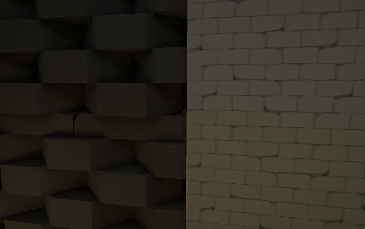
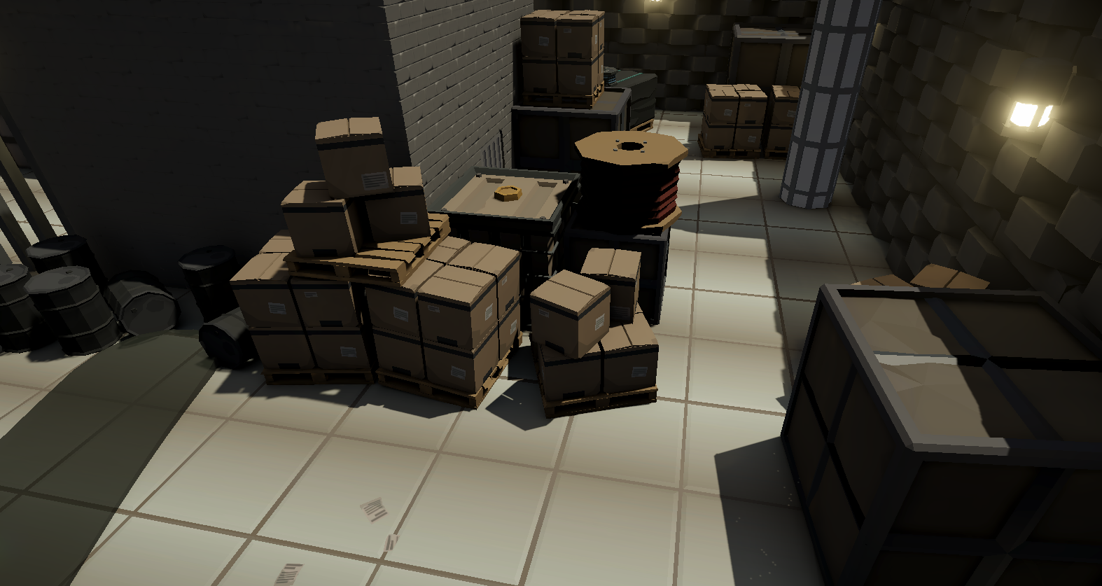
This general problem was important because, for this puzzle, you had to draw on boxes you previously saw that were not drawable. My solution was to make these boxes and objects around them obnoxiously white so that you could see that these boxes were, in fact, drawable. Here are normal boxes in the level:
And here are boxes from the puzzle where the player should recognize that these are paintable:
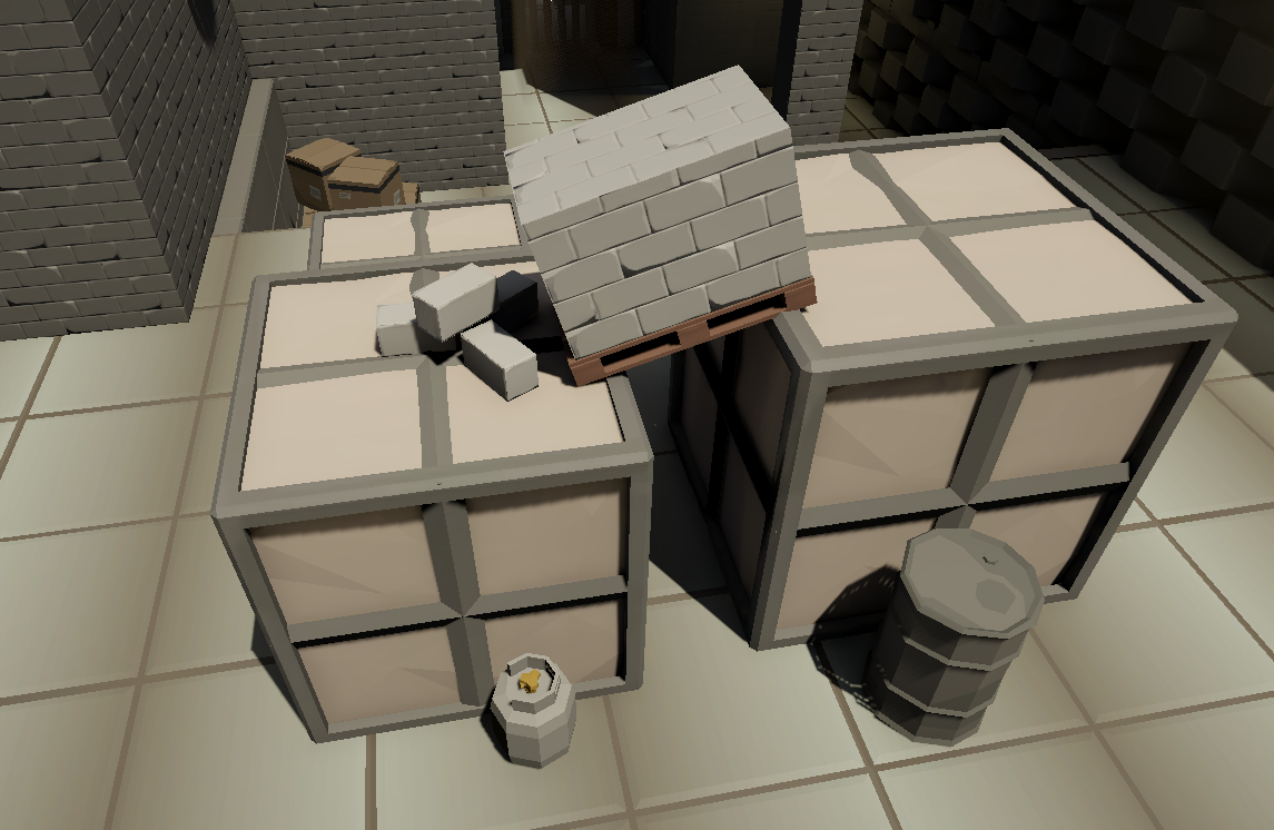
I made this decision based on feedback from playtests, and it turned out nicely.
Now to the second and last area of my level.
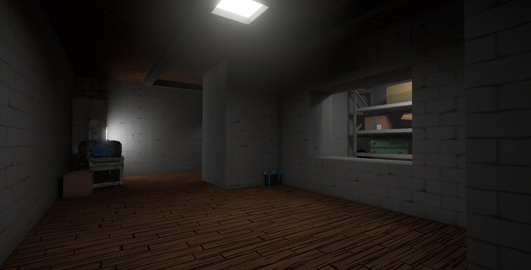
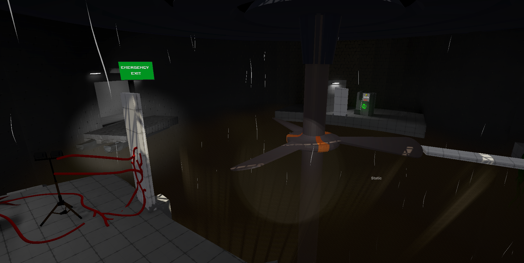
In contrast to the area before, this one feels more constricting and dirty. There's no natural light, and you can find heavy machinery down there, which, all in all, has a more threatening atmosphere. But the story wasn't a big focus point here. What I wanted it to be is a cool ventilation area where you encounter the hardest puzzle yet. So, the more hostile atmosphere and the fact that you're physically descending down into the ground help underline this increase in difficulty. But this sudden increase in difficulty was initially too much for the player. But we'll get to that later. First, let's look at my design sketch:
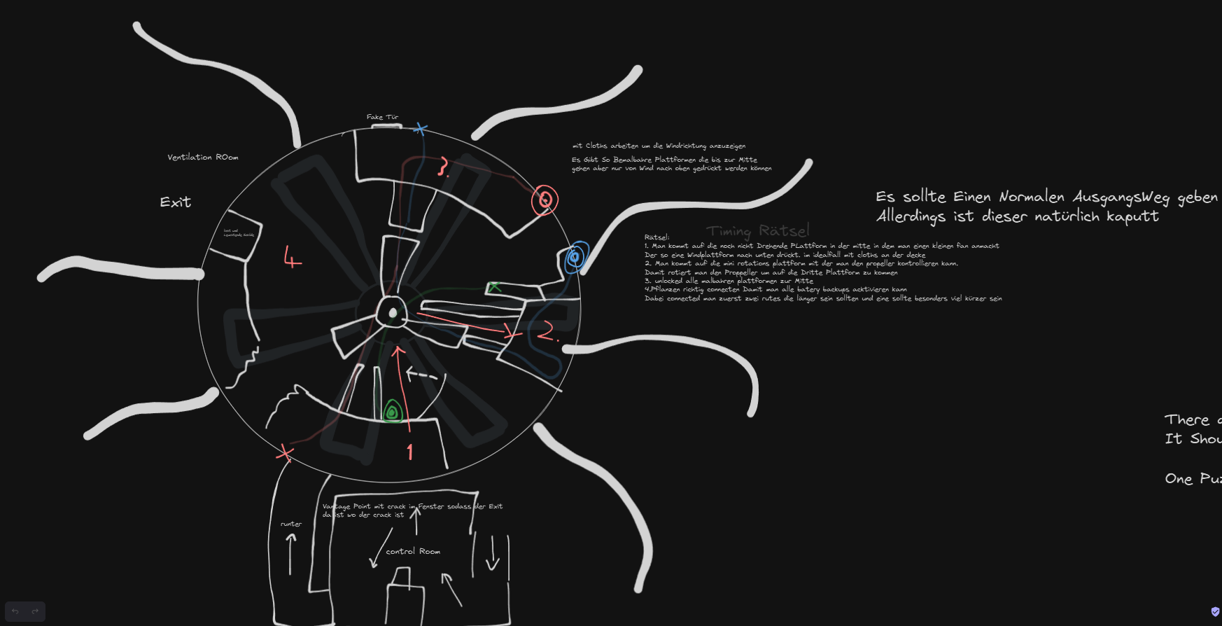
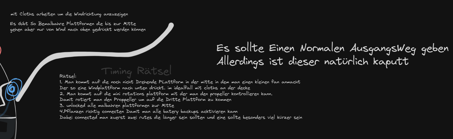
So, I really liked this initial concept and held on to it. But as it turns out, there were multiple problems with it. A few of them were just minor fixes, like changing the growing / dying speed of the plants. But there were more fundamental problems. The main one was that no player could handle this increase in difficulty, but funnily enough after I made a lot of changes, some people said that this was too easy after finishing this level. So, what were these changes? A big underlying problem was that I expected the player to learn a mechanic to solve the puzzle, which I hadn't introduced before. But this turned out to be impossible for almost every player. So, I introduced a room that prepares you for the new mechanics. My idea for the room was that it was basically a compressed and simplified variant of the main puzzle. So, I made a quick little sketch before starting to implement it.
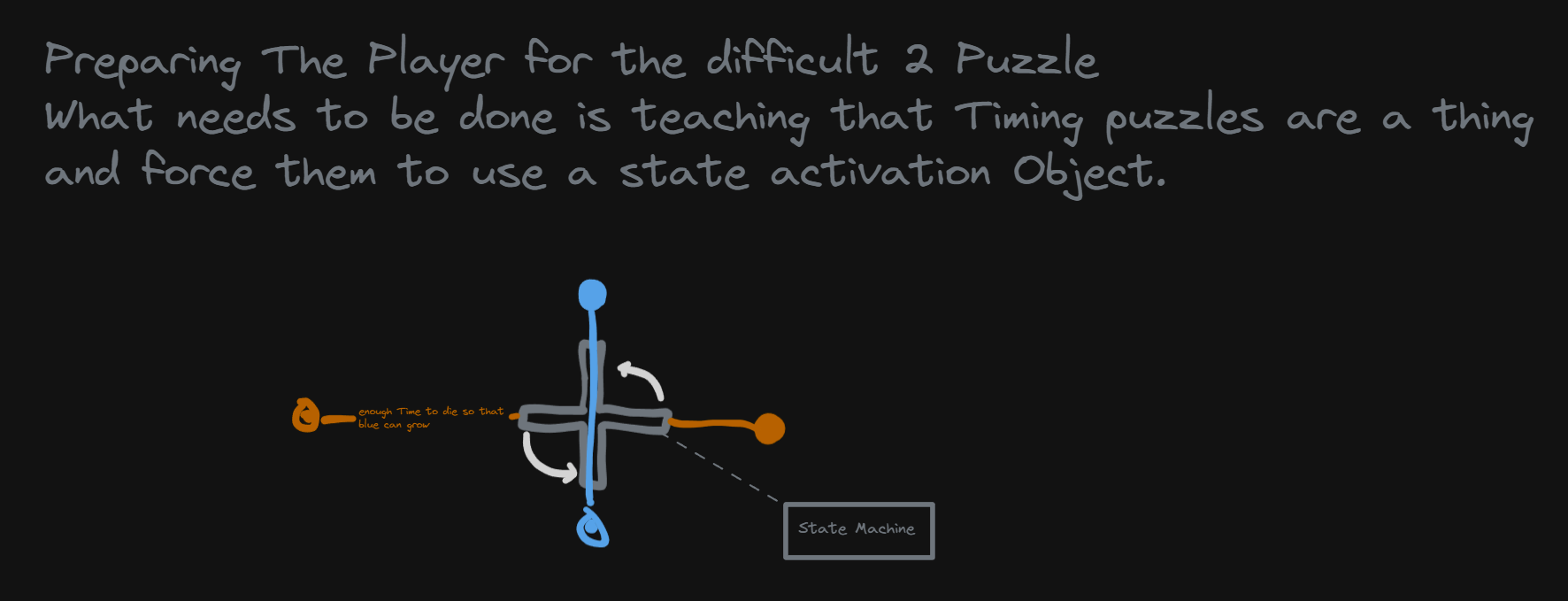
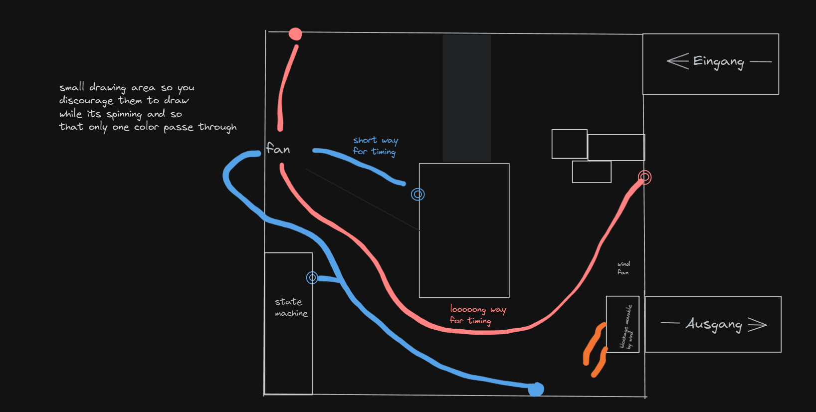
A few things changed here and there, but in the end, this section worked out well. Some people really struggled here for a while before getting it. This was actually nice to see because all of them understood the things I tried to teach them in the end and could apply them to the main puzzle. Here's a quick few of the puzzle itself:
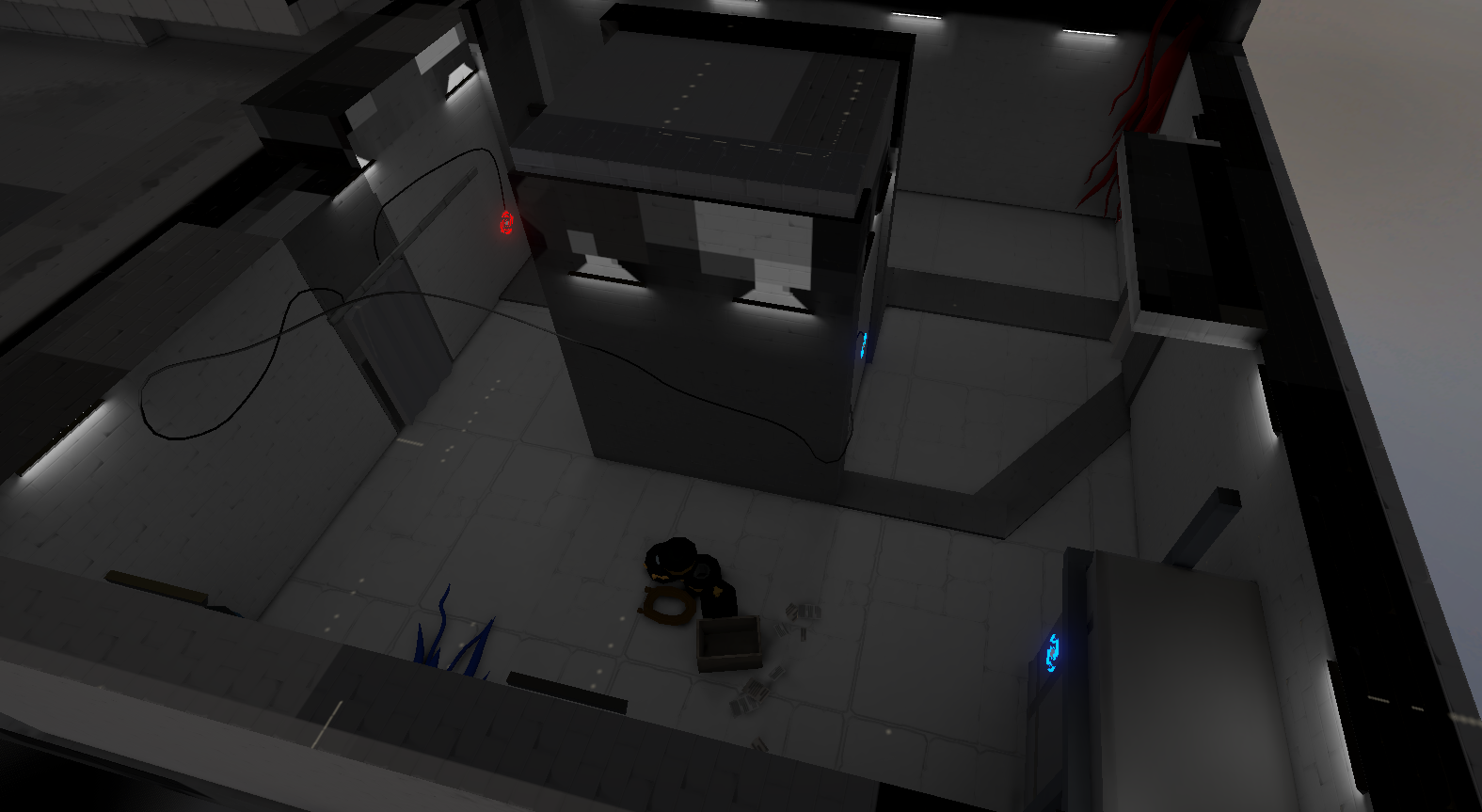
So now one problem remains, which came up a lot during the playtests. The players had difficulty understanding where all pieces relevant to the puzzle were. I had a little graphic of the puzzle in the entrance room showing the rough task you had to do. But this was not nearly enough as it left a lot of interpretation room for the player.
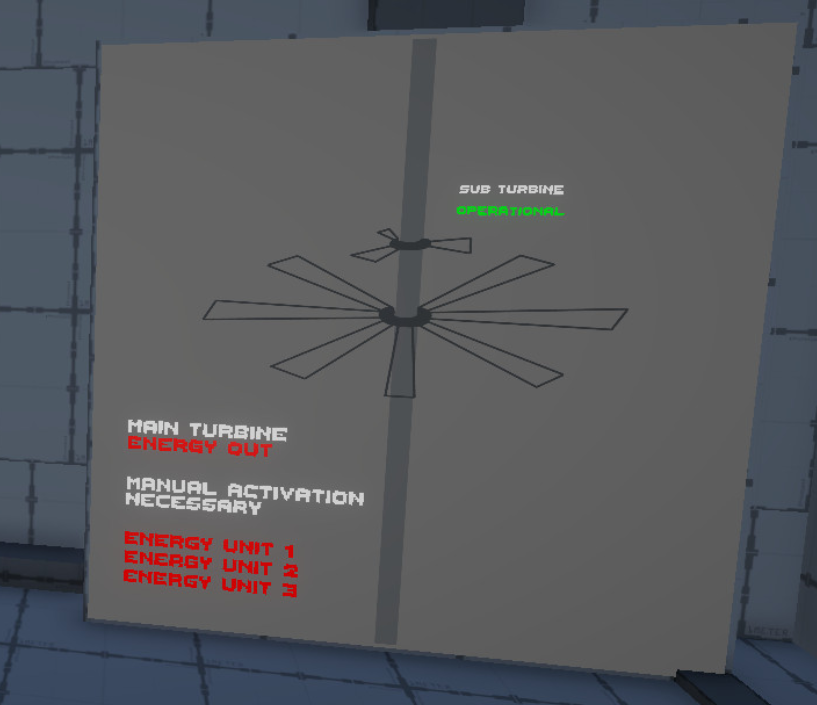
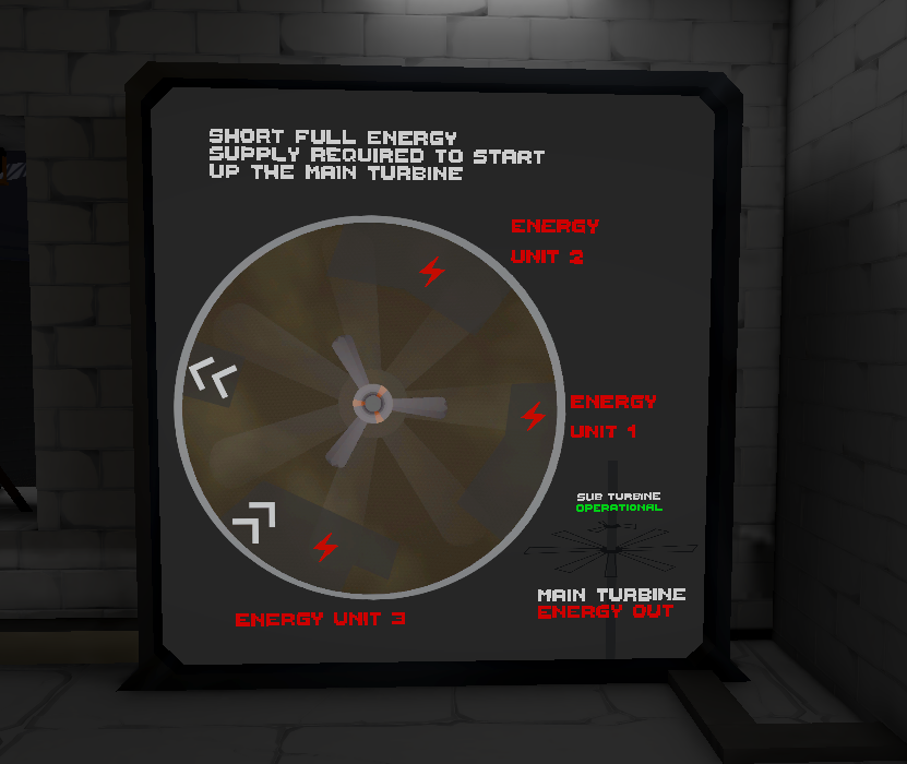
After the first playtest, I massively upgraded this graphic to make it more concrete. The main thing here was to show where the Energy Units the player had to activate were. Also, the text describing your task was way directer, and it dynamically updates the color if an Energy Unit is activated. This is how it currently looks like for comparison:
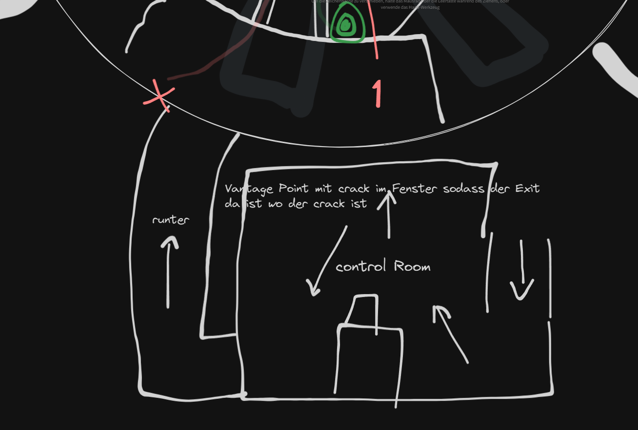
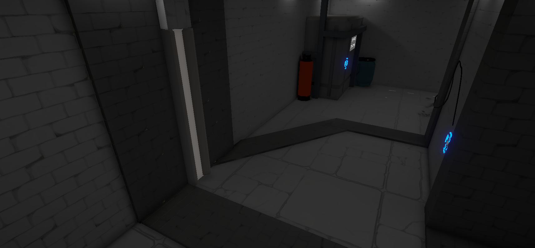
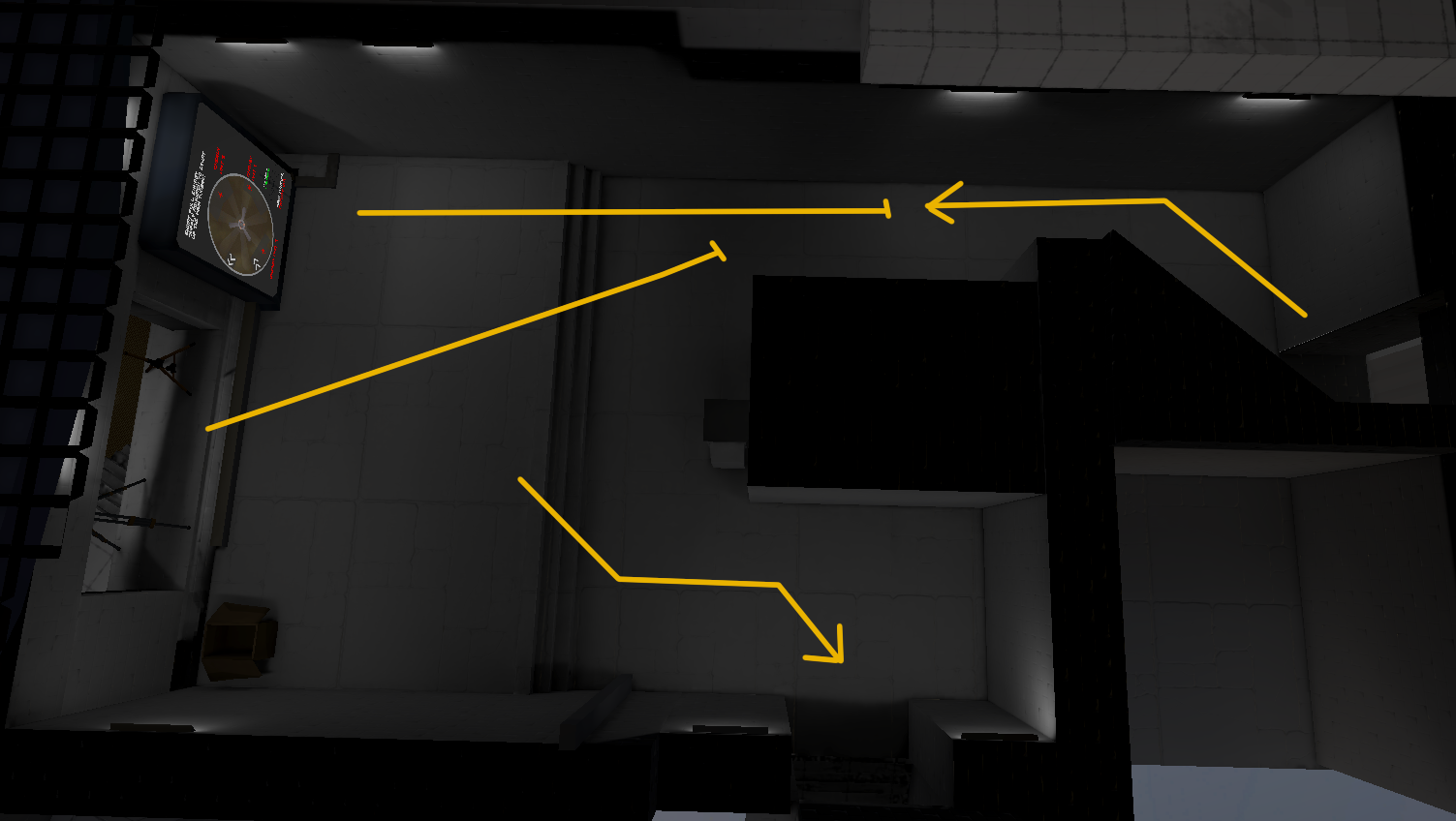
What is also kinda important is that this room exists in the first place. The sketches also showed that a bit. When you enter this room, there are three important sightlines that should guide the player in approaching this puzzle. So, this is the first view of the player when he enters the room.
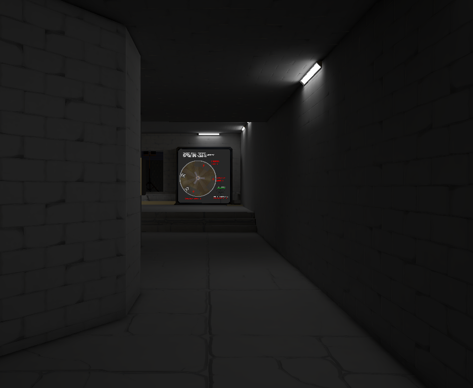
So the first thing you see is the graphic, which contains all the important information needed to solve the puzzle. Then, when you approach it, you see:
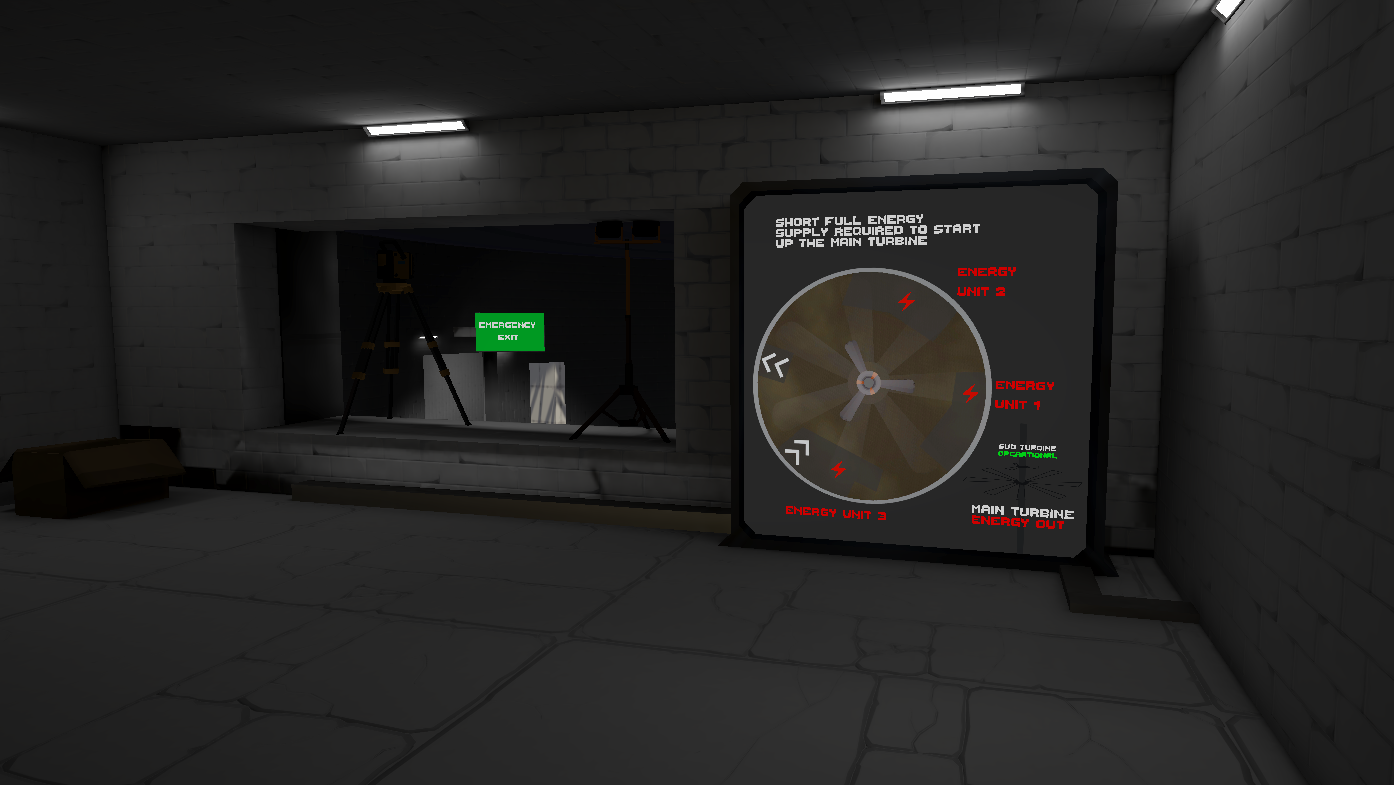
You can now see out of the window on the left. What you see through that window is the exit to the puzzle, which is also your final goal. You could see it before on the graphic, but this underlines it nicely. And then, you approach the window to see the actual puzzle.
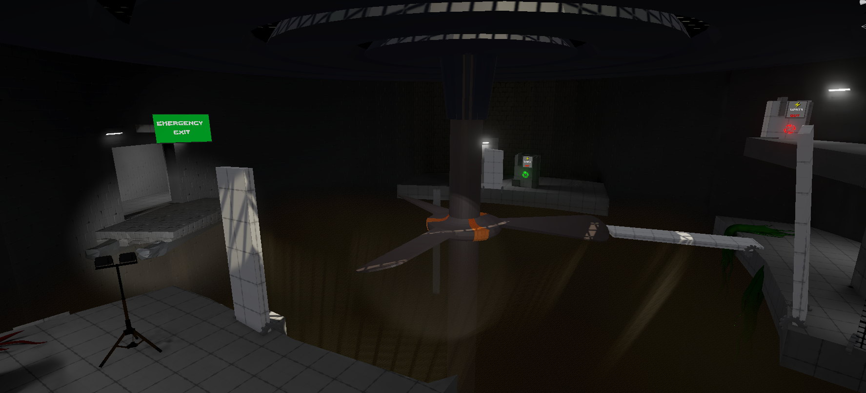
The purpose of this is to create a good vantage point, giving an overview of the puzzle. Here's an image showing off a bit better.
Now, I'm gonna lose a few words about the final puzzle itself, but I'm not gonna ramble on for longer to go into every detail. In the puzzle itself, there was one important platform from where you can control the main turbine, which was not the first platform to not overwhelm the player. The first platform gave the player a very simple riddle where he has to remove some plants holding a board:
This gives the player an opportunity to orient him instead of storming head in. After removing those plants, the board falls down, and the player gains access to the turbine in the center, which connects all 3 Platforms:
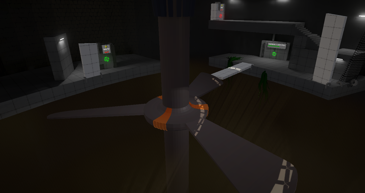
But as you can see, he only has access to one board leading to the second platform. I wanted to do this so that he doesn't go on the 3rd Plattform where nothing important is at the current moment. The other platforms only go down when you first rotate the turbine in the middle because, at this point, you understand everything needed to solve the puzzle and should actually start thinking about the solution. One more problem was how I was gonna bring the player to the exit when you solved the puzzle. When you solve the puzzle, the main turbine activates and gives wind from the bottom of the shaft. The initial idea was to have a platform with a cloth to be pushed up through the wind. But it was really hard to communicate to the player that this platform existed as it was deep down in the smoke and that once the player solved the puzzle, he often wouldn't notice the platform going up. So then I got a genius suggestion from Knowera that you should just have low gravity enabled because of the wind. This turned out to be really noticeable with a huge particle effect, and it was way more fun to suddenly be able to jump really high.
As I said, I could go into way more detail here and there, but I'm going to leave it at this. I really like this project, and I can look back at it and be happy that I made this level where people were actually invested in the puzzles, had genuine jumpscares, and cheesed the hell out of it.
Before I go, somewhere in development, I copied the same object group with different materials around a lot and ended up with 7x the same group in each other. Had to write a tool to delete copies with wrong materials for that. Anyway,
Have a good one!
Comments
Log in with itch.io to leave a comment.
refinery plant is skippable, (piping can, with a lot of effort, be used to solve the puzzles meant for the refinery plant with the tutorial plant)